Friday 13 March 2009

Target audience

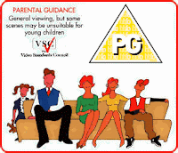
As our opening sequence genre is a "crime caper", we felt that it would not be considered as "universal" but as "parental guidance" or "PG". We believe this as, although it contains some comedy e.g. in the opening scence where Johan steals the wrong painting it also deals with some adult concepts such as robbery and ocassionally contains some mild language.


Labels: ,

Thursday 5 March 2009

Feedback On Rough Cut


After showing Hannah our 'Rough Cut', she gave us some constructive feedback on how we could improve it for the final cut. Hannah gave us the following advice:
  • Remove any unnecessary background noise such as non-cast members chatting or shouting.
  • To obey the 180 rule.
  • To change some shots in order to achieve smoother continuity.
  • Move the titles so that they are not consecutive.
  • Take out shot which jumps from scene to scene.
  • Take out swearing/unnecessary language.
  • Remove duplicated scenes.
In order to improve our first attempt at the opening sequence, advice and guidance must be taken advantage of.
We're sure that the tips given will improve our final cut and improve our grade.

Labels: , , , , , , , , , ,

Behind the Characters

Three people star in the opening sequence: -

'Damingo Flake ' - played by Matt Flack,
'Johan Whit' - played by Jon Whyte,
'Alan Hutter' - played by Ali Hunter.

Obviously the characters are more 'exotic' sounding versions of their own names, but we hope that this adds to the comedy element of the crime caper genre. After research, I have found that in many big screen crime caper movies the characters have unusual and/or humorous names. For example, in 'Ocean's Twelve', Steven Soderbergh, 2004, Brad Pitt plays a character named 'Rusty Ryan' and George Clooney plays 'Danny Ocean'. Furthermore, in the sequence to this film, 'Ocean's Thirteen', Al Pacino plays 'Willy Bank'.

When looking at the names we have chosen for the characters in our production, the names appear to be 'subtle' in the way they sound.

Labels: , ,

Music For Final Cut


After deciding to make our opening sequence a crime caper, we decided the soundtrack needed to have class and style but with an edgy beat to it as well. We felt it was important for the soundtrack to not take itself too seriously, as to take away the whole aura of the genre. We based our soundtrack on the soundtrack of 'Hustle', a popular TV series that is in the same sub-genre as our own film opening.

The music itself, starts off as a lively piece, introducing the beat that will run throughout the soundtrack. The beat is a mix of normal and conga drums, which helps with its lively pace and edgy atmosphere. An 80's style dance synthesizer is then introduced in order to maintain the light-hearted soundtrack whilst introducing the main rhythm. Shortly after this a funky guitar riff is introduced. This gives the stylish sound that helps the listener compare with other soundtracks in the genre. This rhythm continues for a while and then breaks. The music breaks to avoid strenuous repetition.

We are happy with the soundtrack and believe that it is in keeping with the genre and wholly in keeping with the opening sequence.

Labels: , , , ,

Friday 27 February 2009

Behind the Name

'The Grifters'.

Our reasoning for this title is basically just a play on the word 'grafters'.
Grafting suggests someone working for something, but as the crime caper genre has a comedy label attached to it, the 'misspelling' of the word adds that comedy element.

Films of this genre usually have a short, punchy (and sometimes humorous title - getting straight to the point as well as sometimes slightly humorous. We feel that this title has the punchy effect, without giving too much away and maintaining that comedy factor.

Labels: , , ,

Location Troubles


We had some trouble regarding locations. We had decided early on in the planning stage that we'd try to film inside the fitzwilliam museum to add realism to the props and locations. We emailed the Fitzwilliam regarding policy on filming on their premises. Unfortunately they never returned an email. On the day of the shoot we decided that we wouldn't go to the Fitzwilliam to avoid disappointment.

This led to some trouble as therefore we did not have a location in which to shoot the painting scene. Luckily the F block on college grounds had a couple of good quality paintings. We chose one (appropriate to the storyline) and got the scene.

Labels: , , , ,

--ROUGH CUT--

This is the rough cut for our film opening to 'The Grifters'.
From recording data, we uploaded the footage then edited it into the correct sequence order. We have also incorporated a few effects; black and white in some scenes (which we have recognized as a convention in many crime caper films), and slow-motion editing in appropriate places.


We are aware that there is much work to be done in order to make it a successful presentation; this includes titles that are required, and other editing to be done will make it appear to be a more professional sequence.

When watching our rough cut back, it appears we have a couple of scenes which have been duplicated. In the final cut we will correct this, maintaining continuity. There is also mild swearing, which we will withdraw.

Labels: , , ,

Rough Cut Analysis

We have successfully completed filming our rough cut, though we faced some problems which we did our best to resolve. Firstly we originally planned to film in the Fitzwillam Musuem in Cambridge and so we sent an email to the museum asking for their permission to film there. However they didn't reply. So we decided to film on college grounds in the F Block, where we found a large painting which would do the job.

We also decided that as we only filmed in two different locations we had to increase the variation of shots and camera angles, examples ranging from 'POV' to 'over-the-shoulder' shots to provide plenty of match on action. With some clever editing by Ali, Matt and Rob we managed to overcome this problem.

For each scene, we took about three shots, even if we felt the first take was adequate enough. This made the task of editing easier as we could then have a range of angles to choose from.

Labels: , ,

Thursday 26 February 2009

Mood Board


This is our mood board. It shows our research regarding inspirations an locations for our sequence. Click to play and read our mood board.

View more presentations from gueste2ada9.

Labels: , , ,

Friday 13 February 2009

Shot Schedule

1.Shot Framing: Ews(extreme wide shot) This is the establishing shot where it slowly pans forward towards the characters. Action:The three characters Domingo, Alan and Johan. Info: Painting, Costume

2.Shot framing: POV of painting(wide shot). Action: 3 characters looking at painting.Info: Costume. Painting

3.Shot framing: Close up of Domingo. Action: Domingo looks across at Johan with camera tracking across Johan looks happy at painting. Still tracking across to alan whoe's glaring at Alan. Info:costume.

4.Shot framing: Fade out on Johan.Action: Johan still looks happy. Info: costume.

5.Shot framing: Black back ground title name. Action: Title The grifters

6.Shot framing: Black background Bold white writing saying "3 weeks earlier"

7.Shot Framing:
Establishing long shot. Action:3 charcthers around a computer

8.Shot framing: Track and zoom into ransom note

9.Shot framing:Low angle medium close up. Action: How are we going to get 3 000 000 pounds in 25 days. Info costume 2 costume ransom note

Labels: , ,

Thursday 12 February 2009

Location Ideas


Location 1

We are hoping to film in a genuine gallery as to make the sequence as realistic as possible. We are of course aware that we may run into some implications with these locations as many are worried about copyright and other issues, and so understandably do not allow cameras and other media equipment inside. We have emailed the Fitz William Museum in Cambridge asking for permission to film this sequence. If we are denied access, we are aware that trying to replicate this desired location ourselves is very difficult and, most of all, time consuming; which would then have a knock on effect on our editing schedules.

Below is a sketch I have done capturing the main features we hope to include in the 'painting' sequence.
I have explained what my notes as they are unclear in the image I have taken.


(replace image with decent quality version)

The features I have included in the sketch are typical of infamous galleries; red carpet leading up to the most famous or expensive print, ceiling-to-floor pillars (in the Fitz Williams for example), uncluttered appearance, lighting focused on the prints, and curtains pulled aside to reveal prints (may be included in our sequence, depending on if this feature is included in the location available to us).

All this may change or not be possible depending on the location available.


Location 2

The other location we need to use is one that will play a part in the less formal scenes; characters will not be portrayed in smart clothes etc. However, this sequence will give the audience a great insight into the build up of the production.

For the planning stages of the production we will concentrate filming around a desk with a computer. Damingo, the character shown in this scene, will be browsing the London Tate Gallery web page, researching and plotting the 'job'.

Below is an drawing I have done of what the desired location would look like.


This drawing is not representative of the shot types that will be used in the rough cut, but gives a general idea of the location in which we need to film. We have already established that the main shot we will be using for this location is an over-the-shoulder shot; this is an appropriate angle as it is almost a point of view shot, giving an impression of what the character can see and gives the audience yet again another insight into the plot. This also means that a certain amount of the character will be shown, either introducing him or allowing us to explore him more as a con man.

In my opinion, this simplistic and almost stylish environment will give an idea of professionalism which is the look we hope to achieve.

Labels: , , ,

Props

Here is a list of props in which we'll need in order to film our opening sequence.;

1. Ransom note containing magazine cut outs of letters (see below).
This one of the main props in the sequence, as it helps develop the narrative as well .


2. Computer and desk on college site.
3. Character's dressed in informal wear (to emphasize professionalism in more formal scenes).

Labels: , , ,

Wednesday 11 February 2009

Costume Design

We researched costumes used in existing crime caper movies, auch as 'Ocean's Twelve'. We noticed that they dress very smartly, mostly wearing suits, in an attempt to appear wealthy and more respectable. Their casual dress is still fairly smart, apart from if they are on a job and have to get into character, someeimes they have to dress down.

We are going to attempt to replicate this by wearing smart clothes for our production, for the same reasons as mentioned before. As we may not all be able to locate suits, we will wear white shirts underneath dark (preferably blue or black) jackets.

Below is an image of the notes I made reguarding costuming for our production.
I will explain what the image says as it may be hard to read.


A suit is the sort of formal look we are going for; suave and presentable. They would be worn in the scenes in which the characters are standing in the gallery looking at the painting, as they would need to have a good appearance to be taken seriously in this environment.


In my opinion the smart look can be achieved if just the collar and cuffs on the sleeves are visble, and the rest under a dark overcoat or jacket. Dark trousers / jeans would be best.


Hoodies or other casual clothes will be worn in the scenes showing the planning of the 'job'.


For practical reasons these would be worn under shirts that we will wear for the heist scenes, saving time by not having to do costume changes every time we want to shoot another part of the sequence. It would also provide a contrast between the formal dress code, and also give an insight to the characteristics of each individual; when in suits they are all in the same situation, whereas if they are shown in their own clothes it gives us a chance to show their different personalities.


The same trousers can also be worn in these scenes, for practical reasons.

Labels: , ,

Friday 6 February 2009

Possible Shot Locations

Here are some possible shot locations for our opening sequence;

Fitzwillam Museum, Cambridge.


Long Road Sixth Form, Cambridge.


Labels: , , , ,

Shot List

The following is a list of shots we will take when making our opening sequence;

1. (After opening credits- Production logo, credits etc.)

2. Long shot, of 3 males (Matt, Ali, Jon) staring at a (covered) painting.

3. Over the shoulder shot of the boys. (literally closer shot of 2.)

4. Point of view shot of the painting on the wall.

5. Close up of the boys reaction as the cover comes off the painting.

6. Panning shot across the boys reaction, from right to left.

7. (Title of the film appears)

8. (3 weeks before appears)

9. Zooming over the shoulder of Damingo (Matt) at piece of paper.

10. Close up of paper, revealing that it is a ransom note.

11. Long shot of two of the lads (Ali and Jon) arriving at the computer that Damingo is sitting at.

12. Over the shoulder shot of the computer, revealing that the computer shows the London Tate web page. (If the shot does not reveal such information to the audience this shot will follow 12; Screen shot of London Tate museum).

13. Close up of Damingo as he gets an idea.

14. Close up of Alan as he gets the idea.

15. Return to close up of Damingo as he says 'I have an idea boys'.

16. Close.

Labels: , , , , ,

Thursday 22 January 2009

Analysis of 'The Italian Job' Opening Sequence


'The Italian Job' written by Troy Kennedy Martin and directed by Peter Collinson in 1969 is a classic British crime caper film. It starts out with an establishing shot of the Italian alps following a 'Lamborghini Miura' making it way through the mountain range. At this point the music begins,'On Days Like These' by Matt Monro, this gives the start of the film a relaxed light hearted feeling that you would expect from the caper. A number of different shots are designed to show of the land scape adding to the atmosphere drawing the audience into the film. This allows time for the credits to be shown. The writing looks almost hand written which is also an aspect which shows its soft side. As the car heads towards a tunnel the music fades out and you hear the car racing through the tunnel, with a screech of the tires an explosion takes place dragging the audience out of its relaxed state and boosting their interest of the new situation. The camera switches to the other side of the tunnel where we see men and a truck back out of the tunnel telling us this was a deliberate act to get ride of the character in the Lamborghini. this is the point were the story actually begins with the truck pushing the car of the cliff and dramatic music accompanying the action as the reef rolls down the cliff after him. We have established the location in the sun of Italy, the use of sound has changed as the visual image has. the audience is now eager to see how the rest of the film pans out.

Labels: , , , ,

Analysis Of Opening Sequence

As part of our A.S Media project we were required to analyze two opening sequences. As our film is going to be a crime caper I choose to analysis the 1963 classic film "The Pink Panther" as this was one of the first original crime caper movies.

The film begins with when the pink panther diamond was first made. It opens with a young girl been given the pink panther as a gift, from who we assume is her father. The camera then pans forward into the diamond as it is being tied round her neck. The audience is then thrust into this cartoon world where literally a pink panther is shown on the screen. This character is shown inconspicuously moving across screen. Jazz music begins to emphasize the secret nature of the character as he tries to escape from a 'Inspector Clouseau'.

Labels: , ,

Full Synopsis Of Our Film

To save their families a team of crooks, headed by Damingo Flake, must steal a priceless painting worth £3,000,000. Set in modern day London the painting is set to be the most valuable piece of art the Tate has ever seen. With the heist successful the team realize that Johan Whit stole the wrong painting and that they really come away with one worth £300. Its up to the veteran con artist Roberto Coupe to sell the dud for more than its worth. But Johan is convinced that the ex criminal is out to take the cash.

The elaborate plan takes the youngster Alan Hutter out of his depth, but he soon finds his feet amongst the run of the mill criminals. But neither Alan or Damingo believe Johan and his bid to prove to the group that Roberto is a crook, puts the group in jeopardy. Meanwhile the attempts of a former cop to foil the team results in complications for Hutter.

The team are lead around the world by the mysterious Coupe. Selling the painting takes them to Millwall, Monte Carlo, Italy, The Bahamas and Paris. The buyers are more crooked than the team and they face an uphill task to survive in the underbelly of the crime world.

With Johan driving Damingo up the wall, and money running out its a race against time to get the painting out and the cash in. Can the grifters get what they desperately need to save their families?

Labels: , ,

Thursday 15 January 2009

Production Logo Research & Ideas

Part of the overall objective is to design and create our own production company logo. We sketched out a few ideas to start of with, and they can be seen below. They were very quick sketches, and the purpose was to quickly come up with ideas of what it would look like. All designs include text and read, 'R2-54 Productions'. This will obviously not be the final name and the overall design will be more professional, but the sketches display brief ideas of the shape and, to an extent, the design of the logo. The final design will most probably be in colour, and the text will be generated on a computer and have a fresher, cleaner look.


This is the first idea for the design. It is quite a recognisable logo. The 'film reel' design will allow the viewers to relate it to a film, therefore making it obvious that this is what we have set out to do. The text is centre-aligned, giving the clean look. Apart from the text, there is nothing else within the logo, meaning it is not busy and is easy for the viewer to take in.


This design is also simple, yet the 3d effect gives it a more complex feel. I saw a similar design on the Internet, but decided to simplify it, in order to make it easier to understand as the one that i found had a more complex design and was altogether too 'busy' for what we intend to use it for.


This is the most simple design idea of them all. It is a square, with rounded corners and the text once again centre-aligned. We intend to opt for a simple and 'clutter-free' logo, as to hopefully give the whole production a clean appearance.

As we have chosen a British crime caper as our genre of film, we will most probably create a logo which relates to this genre; including conventions which will help to achieve the desired feel of the production.

Labels: , , ,

Analysis of Logos


New Line Cinema logo and Warner brothers pictures are both from the time Warner Company. New Line Cinema are in charge of making the film and will continue to produce merchandise to increase profits. This logo has the classic image of the film reel to relate to what it does, allowing everyone to understand what the company represents. The dark background with light behind the main image draws your focus to the centre followed by the titles, this is how the visual hierarchy has been set up to draw your gaze. the only other information is that their part of the Time Warner Company.

Warner brother pictures in a sub division within the time Warner Company. This is known world wide as the trade mark of Warner brothers, the logo its self has clouds in the background giving it its own structure within any commercial branding it is linked to. The gold and blue work together to create an image that is recognised and connotes trust for parents. The image fills the screen leaving no room for anything to take your eye.

Columbia Pictures from Sony Pictures Entertainment, is almost the opposite to the Time Warner Company. The logo is full, it contains a cloud background but is dark as if at sun set taking your attention up the statue towards the shining light in the centre of the word Columbia, the logo was originally created in 1924 and through out the years has slowly changed to what we see today. The logo has only changed to keep modern but keeping it originality so it can still be recognized by an older audience and acts as a symbol for a respectable company. It suggest Columbia are involved with serious films.

Universal Studios is a film making company from Hollywood it is one of the longest running film production companies. It has generally been the same image since 1912 with the image of the globe and the word universal around it. this is sometimes adapted to the film the film that has been created for instance for 'E.T- Extra Terrestrial', it was shown backwards moving away from the earth towards space.

Labels: , , ,

Tuesday 13 January 2009

The Decision

Our choice consisted of:
1. A supernatural thriller with a strong female lead.
2. A British social realist drama.
3. An adventure story for younger audiences.
4. A teenage romantic comedy.
5. A crime caper with an ensemble cast

As none of our group members were female, it would have been difficult to involve someone else in our project in order to have a strong female lead. We also feel we wouldn't enjoy making this opening and couldn't use our talents to create a high quality film opening sequence.

The British social realist drama was one of the options we narrowed these five down to, however again we thought it was not right as it would be to deep and not allow us to express ourselves.
An adventure story for younger audience was another maybe, but we decided it would be unfeasible to shoot a young child, (a convention of a lead character we thought was common)
A teenage romantic comedy was also ruled out because we don't have a female in the group. We were not so enthusiastic on an all male romantic comedy as we felt it would be easier to have a girl in the group for this.
Finally a crime caper. As a group we couldn't find anything wrong with this idea. It didn't need to have a female in the cast and also didn't need young children or old people to fit its genre. We believe this was the easiest option for a group of our nature.

Labels: , , , , , ,

Friday 9 January 2009

Opening Sequence Analysis - 'Goldeneye'


The opening sequence we have chosen is Martin Campbell's 'Goldeneye' based on Ian Flemings character James Bond.

The scene starts with the recognizable white circle crossing the middle of the picture accompanied by music that is now famous for building tension, action and the start of a Bond film. James Bond then turns and shoots at the screen, this is followed by a blood effect which drops from the top of the screen. This shows his class but also his ruthlessness. You have now been introduced to the main character so the music fades away and the film begins.

'Goldeneye' begins with an establishing shot of a plane flying over a damn, the music has changed to a deeper, softer, mysterious tone as you try to understand whats happening. Notice how the camera zooms into the damn and not follow the plane, now the audience know its the damn that's going to be the focus, not the plane. The camera follows the aircraft in and begins having long shots of Bond running across the damn with the background music slowly increasing in volume and tone. At this point the music dies away and we are left with the main character standing on the edge of the structure as he jumps we hear the wind whistling past him and tells the audience this is a dangerous act. At the end of this part, it is established that Bond is unlike any other man, he is a spy, who has gadgets at his disposal. This will tell the audience he is some form of secret agent.

On entering the building a close up of Bond's eyes is the most the audience has seen of his face and shows his calm and focus. His dark clothes are seen as military and stealthy. The audience see a man in the toilet and then from bird's eye view you see Bond take off the grate. From then you know Bond is about to attack. The man is seen reading a newspaper, which tells the audience he is unaware of the imminent attack. We see the other man in the toilet leave the room, which tells the audience the man on the john is alone. Then comes the first dialogue. This makes a change from the music which preceded it.

After this, we see Bond move out through a door with his weapon in hand and ready to fight ,the silencer indicates he still hasn't been found. Once again the Bond theme kicks in as the pace of the film picks up. He now begins to look around the area checking where he is and needs to go with quick movements and sharp camera work. He encounters the barrel of a gun with someone speaking Russian. However this turns out to be his colleague and both continue the mission together, this increases tension but turns to relief as they know each other.

Labels: , , , ,

Friday 28 November 2008

Succesful Crime Caper Movies

We have chosen to replicate a crime caper movie; as it incorporates seriousness, humour and appeals to a massive audience. From research we also knew that a large number of films are crime capers.

A crime caper is a film that is concentrated on an illegal act, but presented in a funny or light-hearted way. Many of the most successful films made have been crime capers. Below is a list of 10 extremely successful crime caper movies.

'The Italian Job' (original 1969)
'The Italian Job' (remake 2003)
'The Pink Panther' (original 1964)
'The Pink Panther' (remake 2006)
'Gone in 60 Seconds' (2000)
'Ocean's Eleven' (2001)
'Oceans Twelve' (2004)
'The Thomas Crown Affair' (1968)
'Lock, Stock and Two Smoking Barrels' (1999)
'Snatch' (2000)

Labels: , , ,